HMTI Website
Official website for the IT Student Association at Udayana University
Drag to rotate
The HMTI website is the digital home of the Information Technology Student Association at Universitas Udayana. It introduces the organization, its divisions, and its yearly programs to students, and gives members a private area for recruitment, documents, and finances behind a login. As Front-End Developer, I built reusable React components and interactive, responsive pages on top of a Laravel back-end, brainstormed features with the team, and ran QA to keep the experience smooth and bug-free.
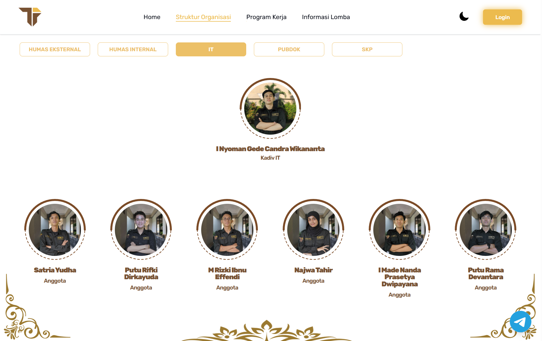
The whole organization, laid out by division
The Struktur Organisasi page presents the organization division by division — External and Internal Relations, IT, Documentation, and more — with a tabbed switcher that swaps the member grid in place. Each person is a reusable profile card showing photo, name, and role, so the same component scales cleanly from a division head down to every member.
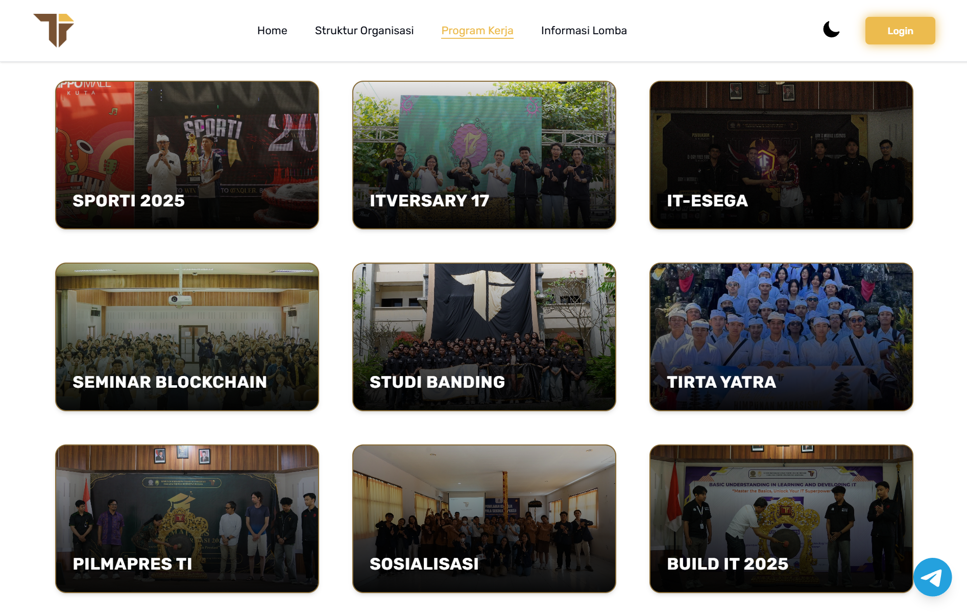
A year of programs at a glance
The Program Kerja page turns HMTI's events — SPORTI, ITVERSARY, IT-ESEGA, seminars, and more — into a clean, card-based gallery. Built from one reusable card with its poster, title, and gradient overlay, the grid stays readable and quick to extend as new programs are added throughout the year.
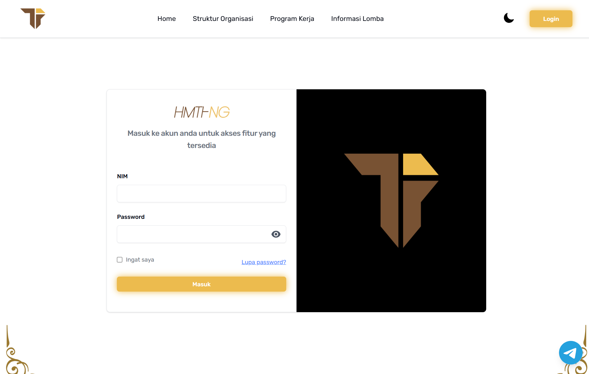
A login gateway for members
Members sign in with their NIM to unlock the internal features. The login screen shares the same visual identity as the public site, with show/hide password, a remember-me option, and clear validation — a small, interactive surface built to feel reliable from the first tap.
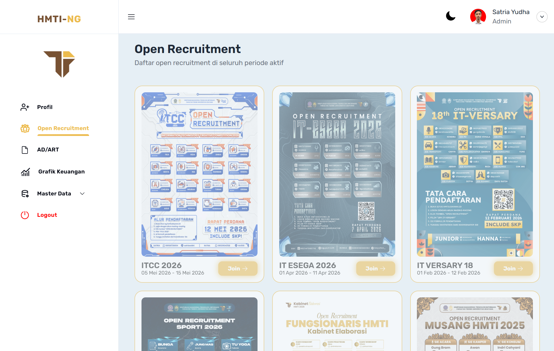
An admin dashboard to run the organization
Behind the login sits a management dashboard where admins handle open recruitment, AD/ART documents, financial charts, and master data from one sidebar. It reuses the same building blocks as the public site, so a data-heavy internal tool and a public-facing page share a single, consistent design language.
My role
- 01Built a library of reusable React components for a consistent UI across every page
- 02Developed interactive pages that stay responsive from mobile to desktop
- 03Wired the React interface to the Laravel back-end so pages run on live data
- 04Brainstormed and discussed ideas with the team to shape features and flows
- 05Ran QA passes across the site to catch and resolve bugs before release
A reusable system, not one-off pages
Rather than hand-building each screen, I assembled the front end from reusable React components — cards, tabs, navigation, and forms — so the public site and the member dashboard stay visually consistent and quick to extend. Every page is responsive by default, adapting from a phone to a wide desktop while preserving the organization's identity and its dark mode.
Built with the team, checked for quality
The React front end runs on a Laravel back-end, so a lot of the work was coordinating with the team — brainstorming features, agreeing on the data the pages needed, and discussing ideas before building them. Before each release I ran QA across the flows, hunting down layout and interaction bugs so the site stayed dependable for the students and members who rely on it.